
ID card guides
ID Card Design: How to Design a Professional Staff ID Card
A professional ID card is not the one with the most on it. It is the one people can read in a second, that clearly belongs to your organisation, and that still looks right once it is printed on PVC. This guide is about the design side: layout, colours, fonts, photos and logo placement, plus the print rules that catch people out.
If you are still deciding which details belong on the card, start with our staff ID card checklist, then come back here to lay it out.
Start with the card you are designing for
A standard ID card is 85.6 x 54 mm, the same size as a bank card (often called CR80). That is a small space, so every element competes for room. Settle two things before you start moving things around: which way the card faces, and who needs to read it and from how far away.
Portrait or landscape?
Portrait cards hang straight on a lanyard and give the photo and name the most height. Landscape cards suit clips, wallets and holders worn sideways, and leave room for a longer job title beside the photo. Both look professional. Pick the one that matches how your staff will wear the card, and use it for everyone so the whole team matches.
Layout: decide what people see first
Someone glancing at a badge wants to know three things: who is this, what do they do, and who do they work for. A good layout answers those questions in that order, so give each element a clear rank.
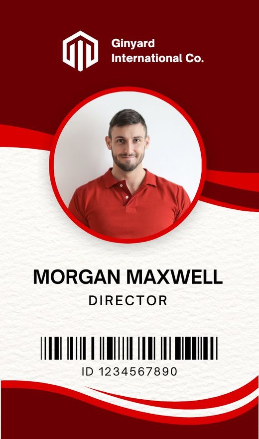
- Photo. The largest single element on the card, because it is how people confirm the card belongs to the person wearing it.
- Name. The largest text on the card. Use the name colleagues actually know the person by.
- Role. Smaller than the name but still easy to read, for example Nurse, Site Manager or Visitor.
- Organisation. Your logo, usually in a top corner or a top band. The NHS identity guidelines, for example, place the organisation logo top right and keep staff badges as clear and simple as possible.
- Everything else. ID number, department or a QR code: smallest, grouped together, or moved to the back.
Use space and alignment
Empty space is what makes a card look designed rather than crowded. Keep a clear margin around the edge, align your text to one edge (left aligned usually reads best next to a photo), and line up the top of the photo, the name and the logo with each other. Mixing centred and left aligned text on one small card is one of the quickest ways to make it look home made.
In the NS Design card designer, a 5 mm editing grid with centre lines helps you line things up, and a safe edge shows how close to the edge of the card you can go. Neither is printed. Click any text, photo or logo to drag it, and drag a corner to make it bigger or smaller.
Design for your longest name
A layout that looks perfect with “Sam Lee” can fall apart with “Alexandra Fitzgerald-Hughes”. Before you finish, test the longest name and the longest job title in your team. If they do not fit on one line at a comfortable size, give the name more width, agree a shorter form for long job titles across everyone, or try the other orientation. Fixing it once in the design saves fixing it card by card later.
Colours: a light background and one brand colour
Colour is where many cards go wrong, and often the problem is the printing rather than the idea. Large areas of dark colour, black or dark blue print badly on PVC cards, so we advise against big dark filled backgrounds even when they look striking on screen.
A safer approach that still looks on brand:
- Use a white or very light background.
- Pick one brand colour and use it with purpose: a band across the top, a thin stripe, a frame around the photo, or the role text.
- Keep body text dark (black or charcoal) on the light areas.
- If your brand colour is navy or black, use it for text and the logo rather than as a large background fill.
Want to see this in practice? Browse the ID card design gallery and pick a light design with a single accent colour as your starting point.
Use colour to mean something
Colour bands by role (staff, contractor, visitor) let reception or security tell people apart from across a room. If you colour code, change only the band colour and the role word, and keep everything else identical, so every card still looks like part of the same set. Always write the role in words too, because colour on its own is easy to miss and not everyone sees colours the same way.
Check contrast
Text needs strong contrast with whatever sits behind it. Avoid placing text over photos, patterns or gradients, and avoid pale text such as light grey, yellow or pastel shades on a white card.
Fonts: fewer is better
- Use one font family, two at most.
- Choose a plain, clear sans serif. Script, handwritten, very thin or tightly condensed fonts are hard to read at card size.
- Create hierarchy with size and weight (a bold name, a regular role) rather than adding more fonts.
- Capitals work for short labels such as VISITOR, but full names are easier to read in normal case.
Photos: make the whole set consistent
Our checklist covers what makes a good individual photo. For design, the thing that matters most is consistency. A batch of cards looks professional when every photo is framed the same way.
- Use the same crop for everyone: head and shoulders, with heads at roughly the same size.
- Keep backgrounds plain and similar. The designer can remove the background if photos were taken in different places.
- Use the same frame shape on every card, whether square, rounded or circular.
- Ask for front-facing photos in even light. Phone photos are fine, and you can crop and brighten them in the designer.
In the card designer you add a photo for each person, and when you drag it near the photo frame it snaps in and takes the frame’s shape, so every card in the set matches.
Logo placement
- Place the logo in a top corner or in the top band, not in the middle of the card.
- Use a logo file with a white or transparent background so it sits cleanly on a light card.
- Keep its proportions when you resize it. A stretched or squashed logo is noticed straight away.
- Make it clear but not dominant. The name and photo should still be the first things people see.
In the designer you upload your logo once and it goes on every card, so there is no risk of one person’s card carrying an old version.
Use the back to keep the front clean
If the front is getting crowded, move the secondary details to the reverse. A reverse side adds £1.00 per card. Common uses for the back:
- “If found, please return to” with a work address or reception number (never a home address).
- A QR code linking to your website or a contact page. QR codes are free.
- Short terms of use, such as “This card remains the property of” your organisation.
If you want a card that opens a link with a tap of a phone, NFC encoding adds £2.50 per card.
Check before you order
Screens make cards look bigger than they are. Download the free PDF of your cards, print a page at actual size (100%, not “fit to page”), and hold it at arm’s length. That shows you straight away whether the name is readable and whether anything is too close to the edge.
Quick design checklist
- One orientation for the whole team.
- Photo is the largest element, name is the largest text.
- Logo in a top corner or band, not stretched.
- Light background, one brand colour, no large dark fills.
- One font family, dark text on light areas.
- Longest name and job title fit on one line.
- Every photo cropped the same way, in the same frame shape.
- Nothing important outside the safe edge.
- Spelling checked against your staff list.
Start from a design that already follows these rules
You do not have to build a card from a blank page. The NS Design card designer has 70 ready-made designs in portrait and landscape. Choose one with a light background, add your logo once, then add your people by typing their names and roles or uploading a CSV. If you are doing a whole team, our guide to ordering ID cards for your whole team walks through it step by step, and if you would rather have a first layout made for you, see how to make an ID card with AI.
Designing is free and you can download a PDF of every card before you order. Printed cards start from £4.99 each, there is no minimum order, and you can add lanyards and card holders. Cards are printed in the UK and sent by tracked Royal Mail: delivery is £3.95 per order and free on orders of £30 or more.
Open the card designer and try your logo and longest name on a light design, or browse the design gallery first. For an overview of all the ways to start, see our ID card maker guide.
Frequently asked questions
What makes an ID card look professional?
A clear order of importance: a large photo, the name as the largest text, a smaller job title and the logo in a top corner. Add plenty of empty space, one font family, a light background with one brand colour, and the same photo crop for everyone.
What colours are best for an ID card?
A white or very light background with one brand colour used as a band, stripe or accent, and dark text. Avoid large dark, black or dark blue filled areas, because they print badly on PVC cards.
Should an ID card be portrait or landscape?
Either can look professional. Portrait hangs straight on a lanyard and gives the photo and name more height. Landscape suits clips and holders worn sideways and leaves room for longer job titles. Choose one and use it for the whole team.
What font should I use on an ID card?
A plain, clear sans serif font. Use one font family, two at most, and make the name bold and larger than the job title. Avoid script, handwritten, very thin or condensed fonts, which are hard to read at card size.
What size is an ID card design?
A standard ID card is 85.6 x 54 mm, the same size as a bank card, in portrait or landscape. The NS Design card designer is already set to this size and shows a safe edge so important details are not placed too close to the edge.